From a Zoom call to 3 million students
StudyStream
combinator
Leading product design for a YC-backed startup from its earliest concept — shaping vision, building the research infrastructure, and iterating a platform to product-market fit at global scale.
Impact
3M+
students on the platform
86%
of users joined to study with others
30+
user interviews in the Top 50 project
0 → 1
from a Zoom link to a global platform
Where It Started
A Zoom room full of strangers doing their homework
StudyStream began with an observation: students were voluntarily joining Zoom rooms not to talk, but to study alongside strangers. No agenda. No structure. Just the quiet presence of other people doing the same hard thing. Something real was happening in those rooms, and the founders wanted to understand it — and build something worthy of it.
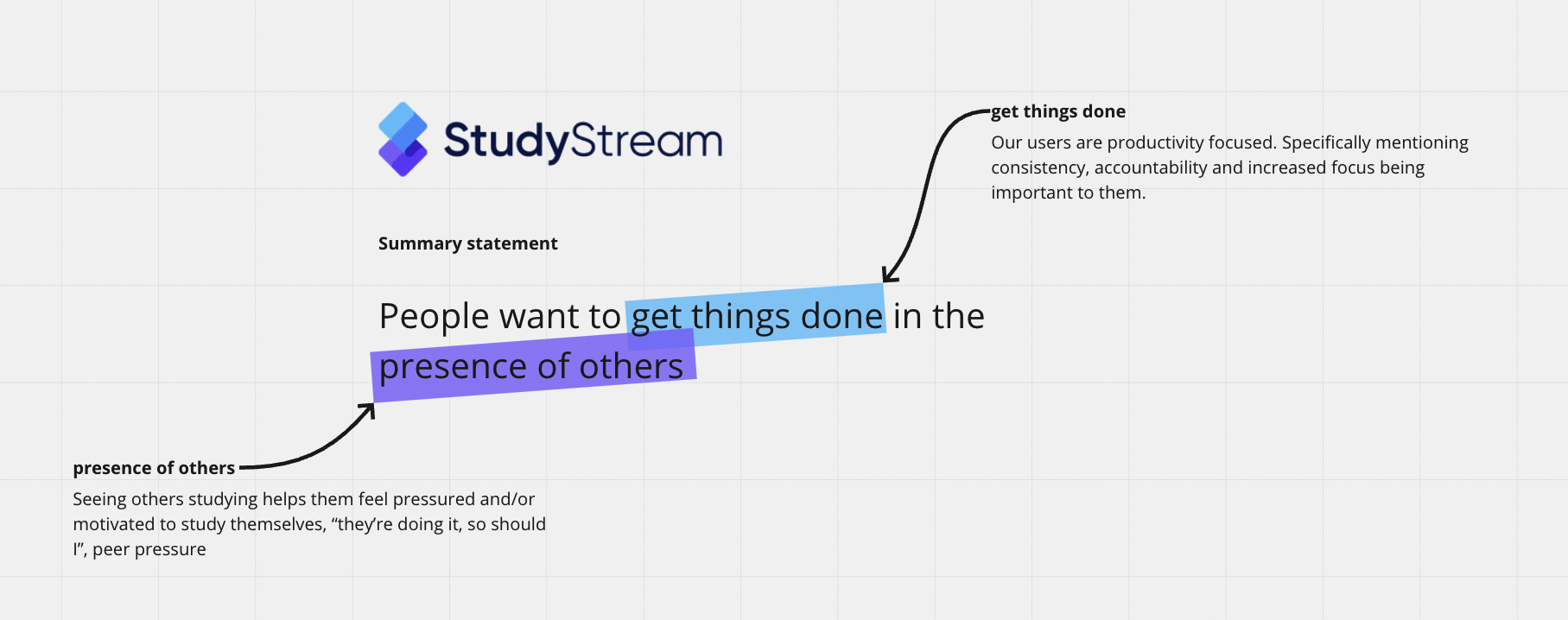
That's where I came in. Before any product existed, I worked with the co-founders on the fundamentals: mission, vision, and values. What was StudyStream actually for? Who was it for? What did it believe about how people learn? Getting that foundation right wasn't a formality — it was the lens every product decision would be made through. From conversations with early Zoom users, Discord community members, and people showing up every day to study with strangers, we built a picture of what was really driving the behaviour.
"People want to get things done in the presence of others."
Core Insight
Two forces were at work. Users wanted accountability and focus — a place to simply get things done. And they were motivated by seeing others studying. Not competition. Not chat. Just the quiet signal that someone else was in it too. The platform's job was to hold both of those things without pulling them apart.
Building the MVP
Turning what we knew into something people could use
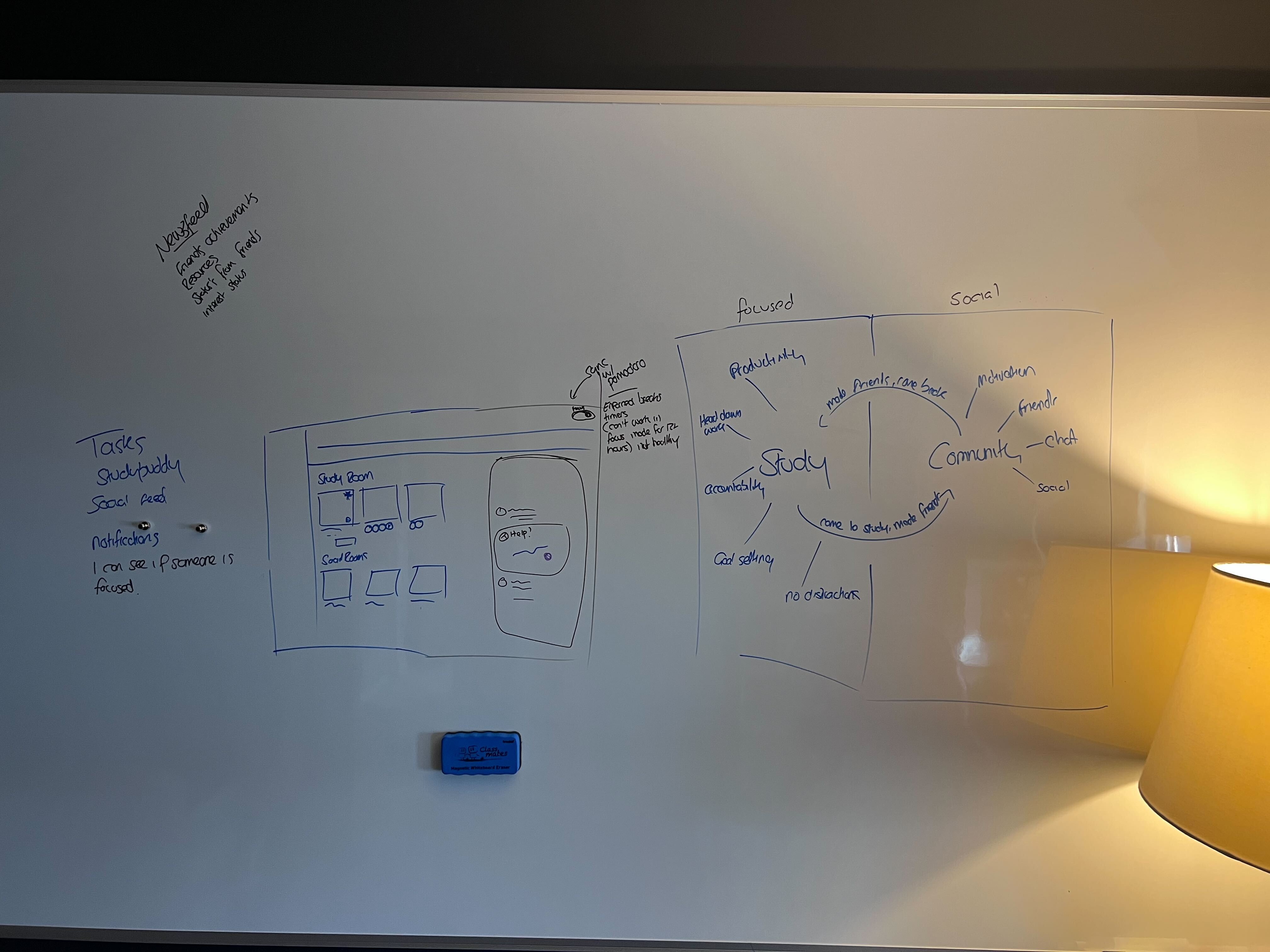
With that grounding in place, I moved into design. Early whiteboard sessions mapped the two core modes the product needed: a focused study environment at its heart, and a social layer that would let community form naturally around it. The question wasn't whether to have both — the research made that clear. The question was how to sequence them so neither undermined the other.
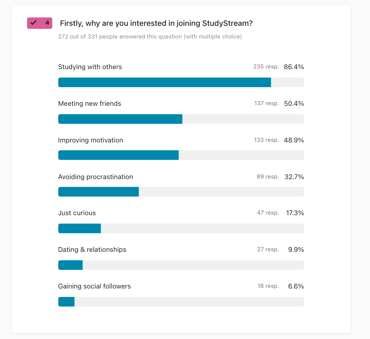
Survey data from the growing Zoom and Discord community shaped the architecture further. Of over 330 respondents, 86.4% came primarily to study with others — but 50% also cited making friends, and nearly 49% mentioned improving motivation. The product had to serve all three without becoming unfocused itself.
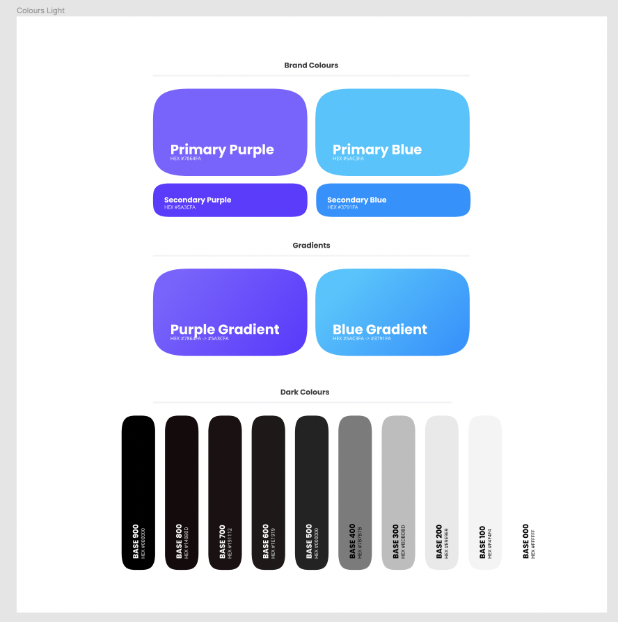
I built the design system from scratch alongside the product — establishing the visual language, component library, colour system, and typography that would need to carry the product from early prototype through to a platform serving millions.
[Image: Slide 16 — the launched MVP with study rooms, event spotlight, social feed - Image not available]
The Aha Moment
We saw it on her face before we could explain it
During user testing of an early version of the MVP, something happened that changed the direction of the product. A user navigated into the focus room for the first time — and her reaction was immediate. You could see it on her face. You could hear it in her voice. The room, the people, the quiet shared focus — it landed in a way that none of us had fully anticipated. That was the magic. Not explained, not prompted. Just felt.
That moment sharpened everything. If the focus room was where the product came alive, then the entire MVP needed to be in service of getting users there as fast as possible. We restructured the experience around that — reducing friction, shortening the path, making the focus room the first thing people encountered rather than something they had to find.
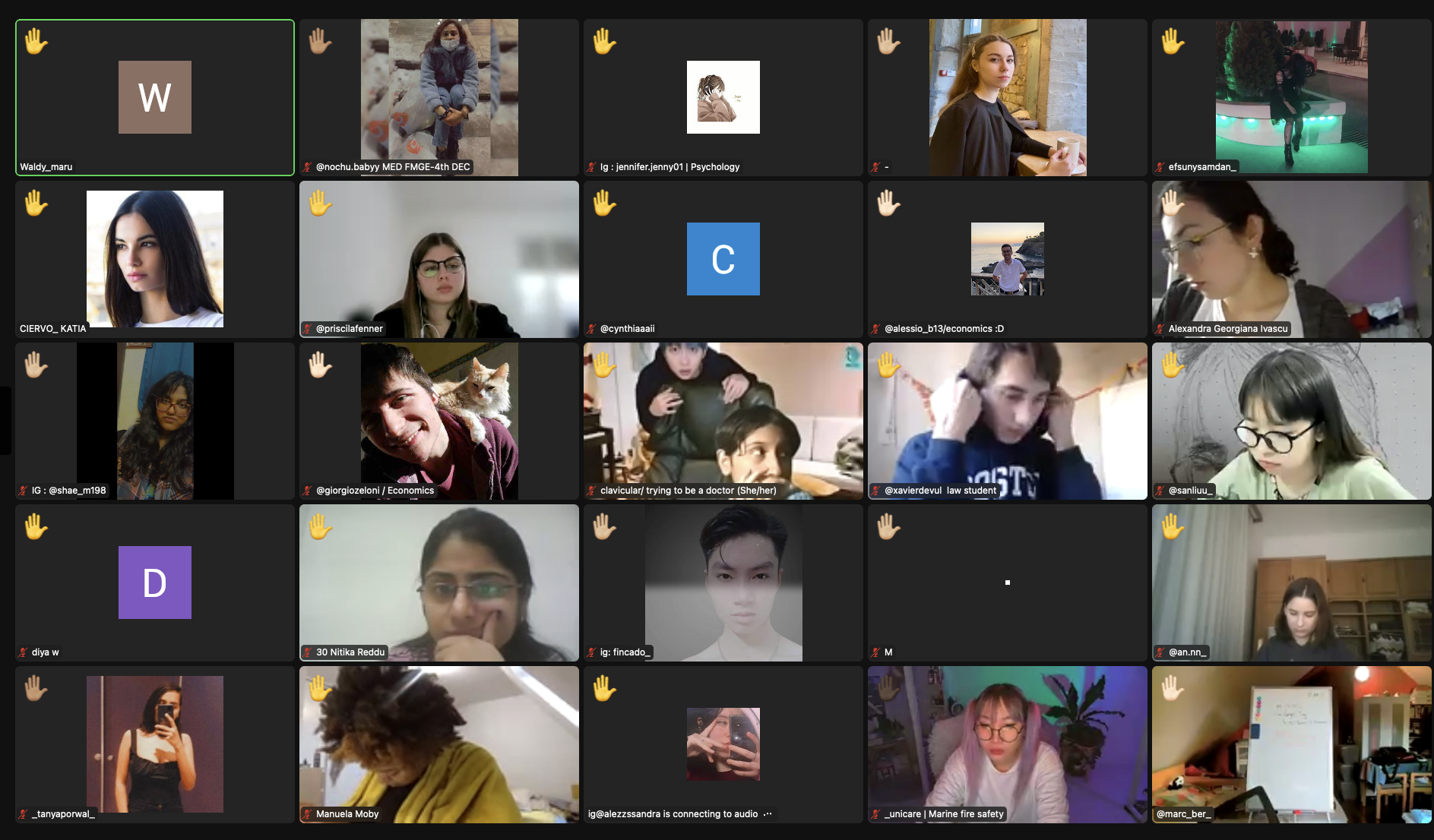
We launched. And users started coming off Zoom.
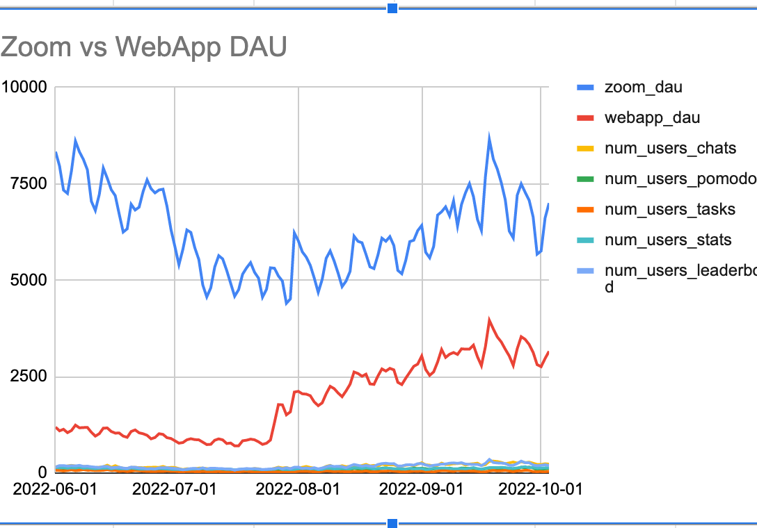
The crossover wasn't gradual. Once users experienced the product, the Zoom sessions declined and the web app climbed. The community was moving — and they were telling each other to move too.
"I think it's the best study site I've ever found. It makes studying more motivating and makes me want to go here every day to get things done."
— Community user, Discord
"i'm so thankful for this server ❤️"
— Community user, Discord
Building the Research Infrastructure
Turning scattered signals into something we could act on
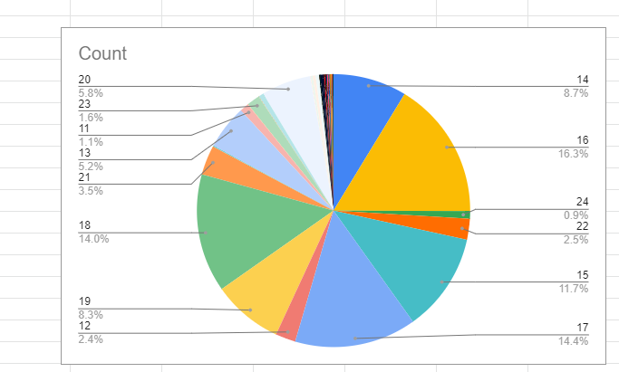
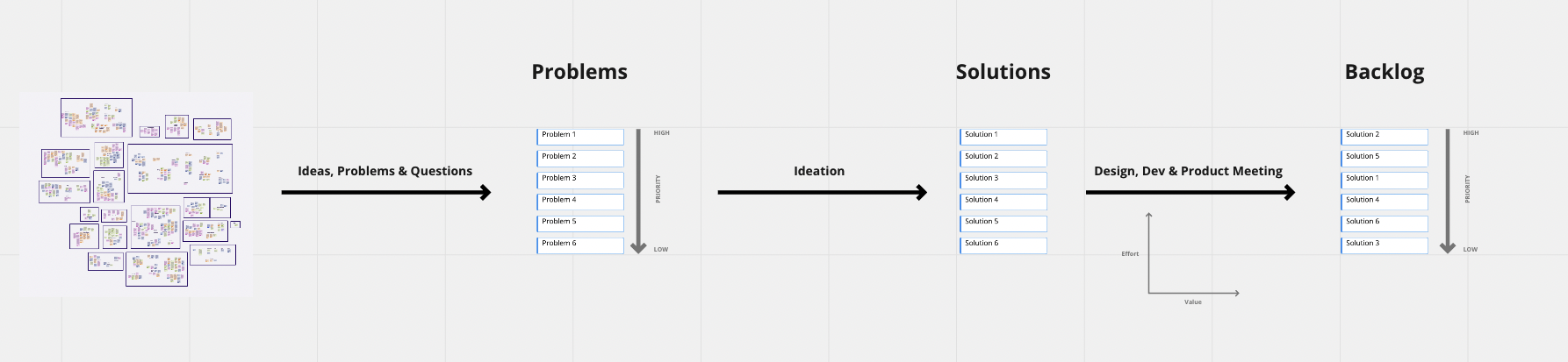
With users on the platform and feedback arriving from every direction — Discord messages, in-app reports, user interviews, Hotjar recordings, analytics, in-app surveys — the challenge became structure. How do you make sure nothing important gets lost? How do you spot patterns across hundreds of individual signals?
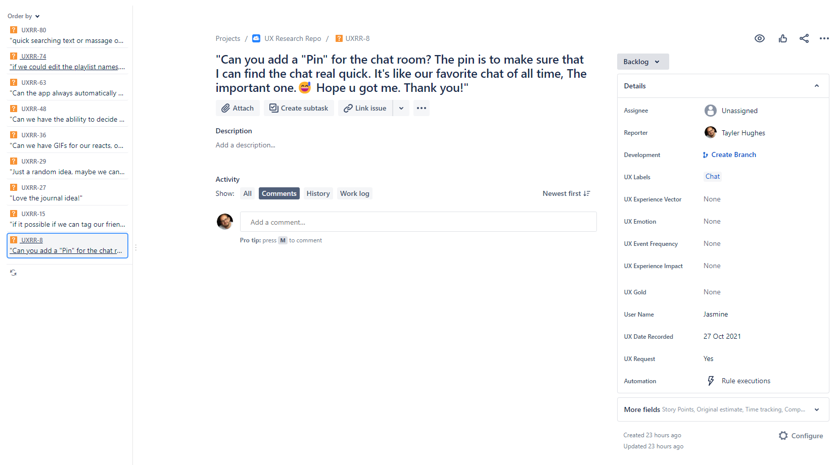
I built StudyStream's research repository from scratch, starting in Jira. I created a custom schema with UX labels, experience vectors, emotion tags, event frequency markers, and user name fields — so every piece of feedback, regardless of where it came from, could be tagged, queried, and compared. A Discord message sat alongside an interview transcript alongside an in-app report, all coded consistently.
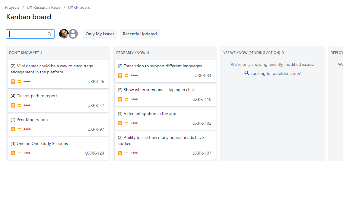
The system tracked insights through confidence levels — from things we'd heard once and weren't sure about, through to things we knew with enough certainty to act on. It also included a "Triple Fire Alarm" filter: any signal that was both negative and high-frequency surfaced automatically, so nothing critical could be buried under volume.
As the team and the data grew, the repo moved to Dovetail. The tooling changed; the taxonomy and the discipline stayed the same.
Top 50
Going deeper with the people who mattered most
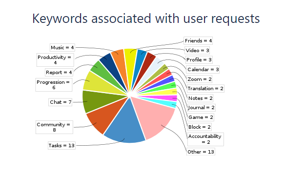
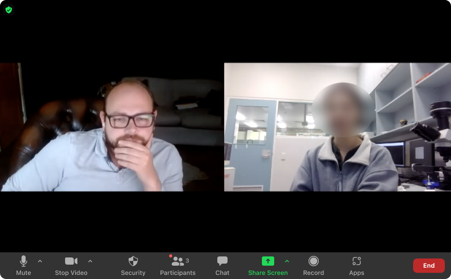
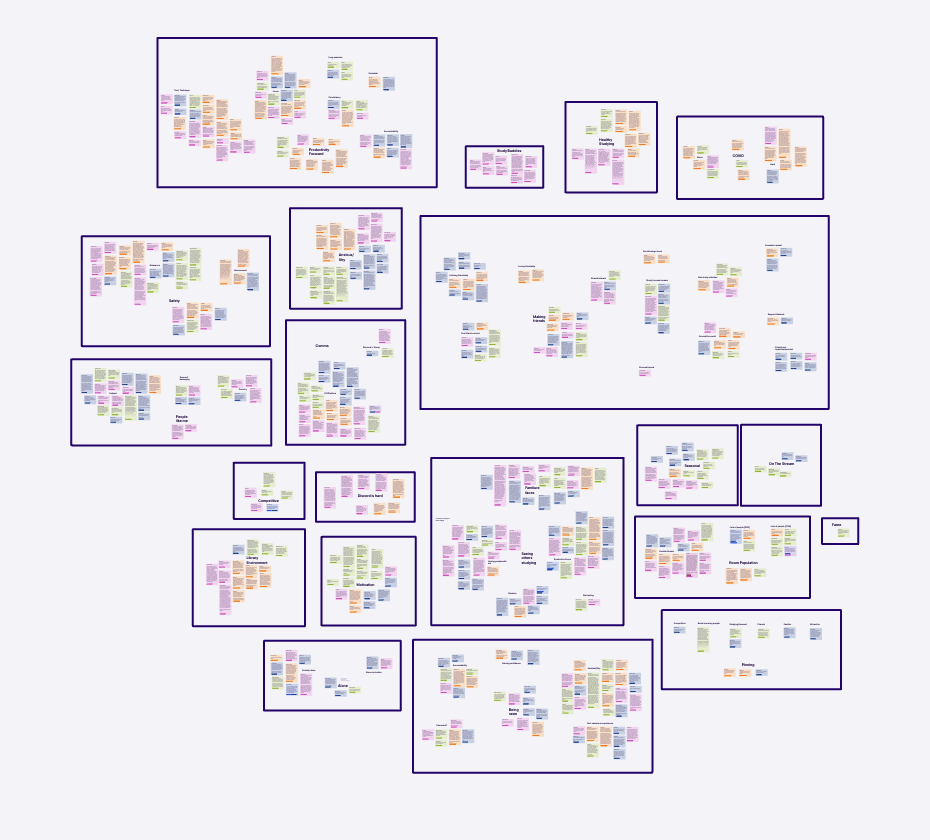
With a solid foundation of ongoing research in place, we identified an opportunity to go much deeper. We ran a focused project — the Top 50 — selecting StudyStream's fifty most engaged, highest-value users and conducting in-depth interviews with over thirty of them. I ran many of these sessions myself, alongside other members of the team.
These weren't quick pulse checks. They were long, open conversations — about how people studied, what their days looked like, what brought them to StudyStream and what kept them coming back. Every session was transcribed, tagged, and entered into Dovetail. Then we ran affinity mapping across the full body of interviews, grouping observations until the patterns became impossible to ignore.
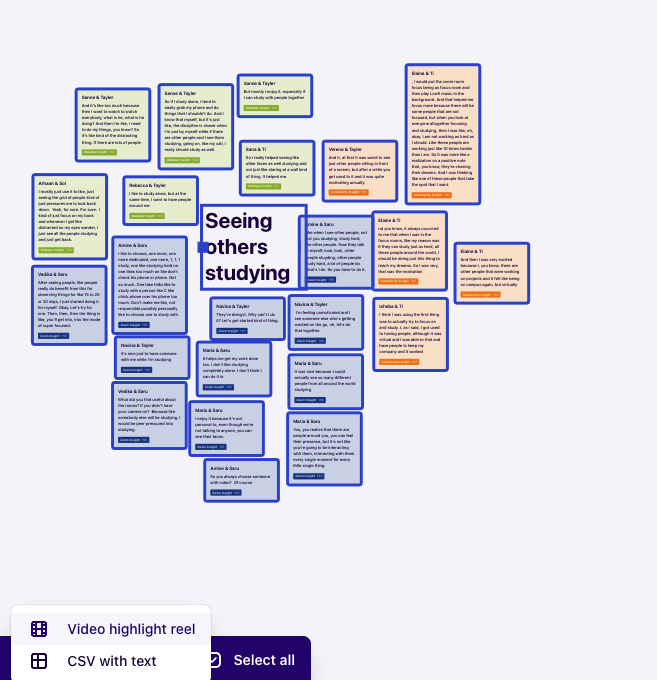
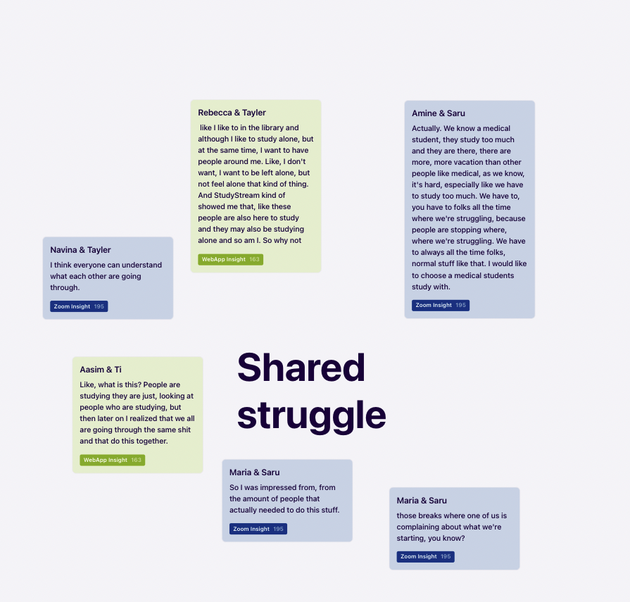
The most important thing the Top 50 revealed wasn't a feature request. It was an emotional truth: for these users, StudyStream wasn't just a productivity tool. It was a place where they felt less alone. Studying is a solitary, often demoralising experience. The platform gave them company in that — and for the most engaged users, connection wasn't a nice-to-have. It was the whole point.
"Like, what is this? People are studying, they are just looking at people who are studying, but then later on I realized that we all are going through the same shit and that we do this together."
— Assim & Ti, Top 50 interview
That finding reoriented how we thought about the product and drove a significant wave of iterations focused on deepening connection — not just enabling focus. The social graph, the encouragement system, the pin mechanic, the move toward smaller rooms and one-to-one study sessions — all of it was shaped by what we heard in the Top 50.
Iterating in Production
Ideas that were built, tested, and earned their place
With the Top 50 insights driving the backlog, the team moved fast. Solutions were designed, shipped, and measured against a clear definition of success. Things that worked stayed. Things that didn't were killed. Below is a selection of what we iterated on.
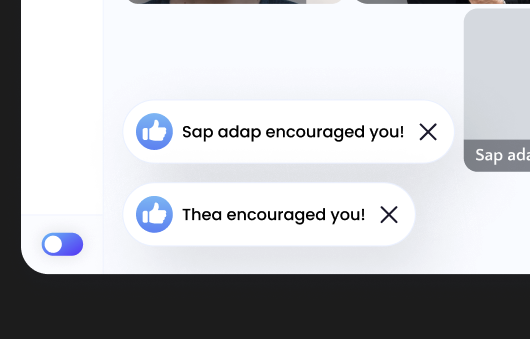
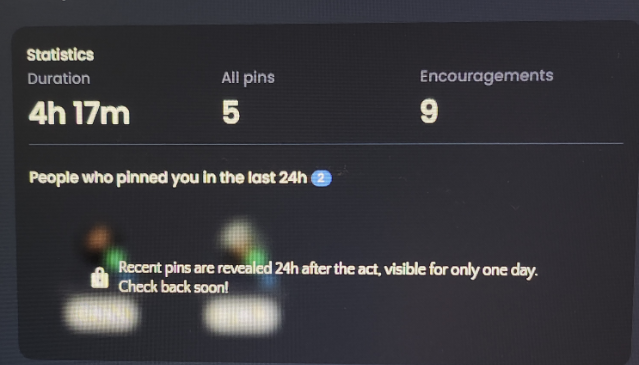
Social presence: encouragement and connection
We built and iterated on an encouragement system — letting users send recognition to others in the room — and a pin mechanic that let users save people they wanted to study with again. Both features were direct responses to what the Top 50 told us: that being seen mattered, and that familiarity made the experience significantly more valuable.
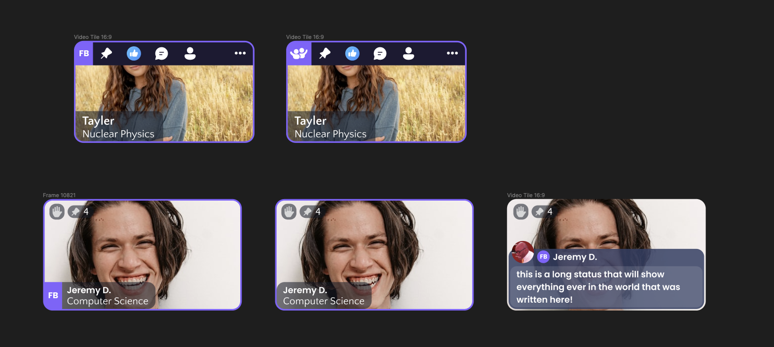
The video tile
The video tile was the face of every person in every room — carrying their name, subject, pin count, status, and social signals. It was one of the most iterated components in the product. We explored multiple directions for information density, hover states, and hierarchy, trying to find the balance between personality and the focused atmosphere the rooms needed to maintain.
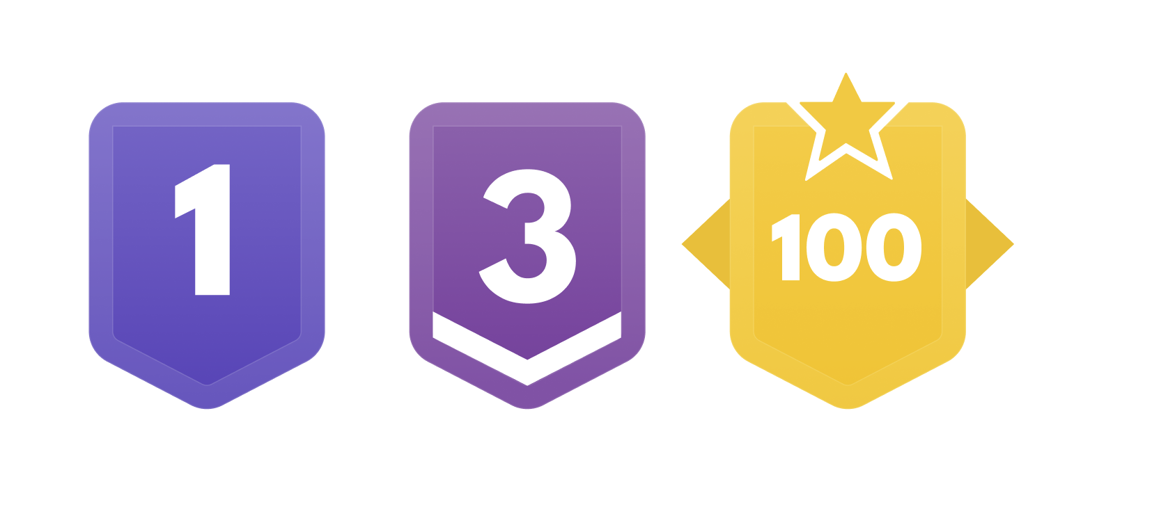
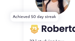
Streaks, levels, and visible progress
StudyStream's users were students who already tracked grades and built habits. Streak tracking, daily study counters, and a levelling badge system gave users external signals of their own consistency — making dedication feel recognised without turning the product into something competitive or distracting.
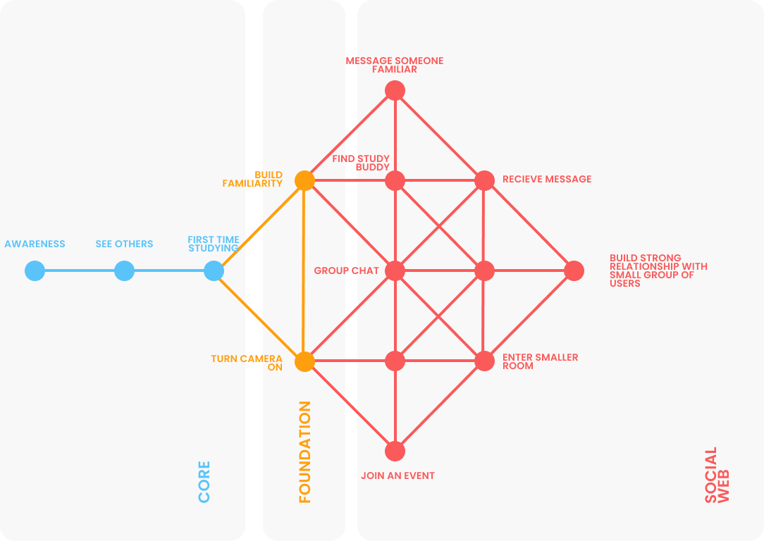
The social web framework
To help the team think clearly about where features sat in the user journey, I developed the social web framework — mapping the progression from a user's first moment (awareness, seeing others study, turning camera on) through foundation mechanics (group chat, finding a study buddy, smaller rooms) and out toward deep, lasting relationships. It gave everyone a shared language for talking about connection and where the product needed to invest next.
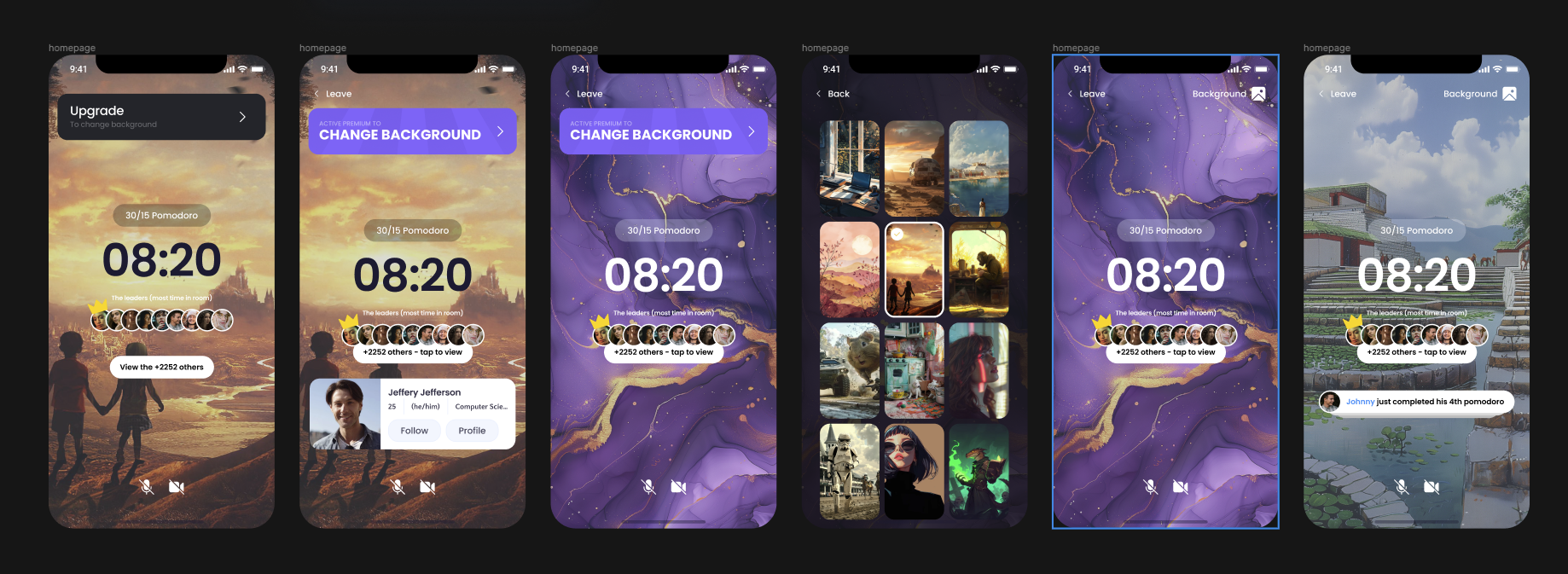
Going mobile
As the product matured, mobile became essential. The mobile app brought the core study room experience to iOS alongside background customisation, a pomodoro focus mode, and social nudges — built for the environments where students actually studied.
Reflection
What this taught me about design at pace
StudyStream was one of the most formative engagements of my career — not because of the scale, but because of the speed and the stakes. When you're building for a community that's actively cheering you on, the feedback loop is short and the work feels real. Users told you what they loved and what hurt them. The job was to keep listening.
The things I'm proudest of aren't the individual screens. They're the infrastructure: a research system that scaled with the company, a process that turned scattered signals into prioritised decisions, and a team culture where design and data were genuinely trusted together. Those things outlasted any single feature.
Tayler Hughes · hello@taylerhughes.co.uk · LinkedIn